Known as the first domain registrar, Network Solutions has drastically influenced the evolution of the Internet. How does the brand continue to stay relevant in the modern design meta?
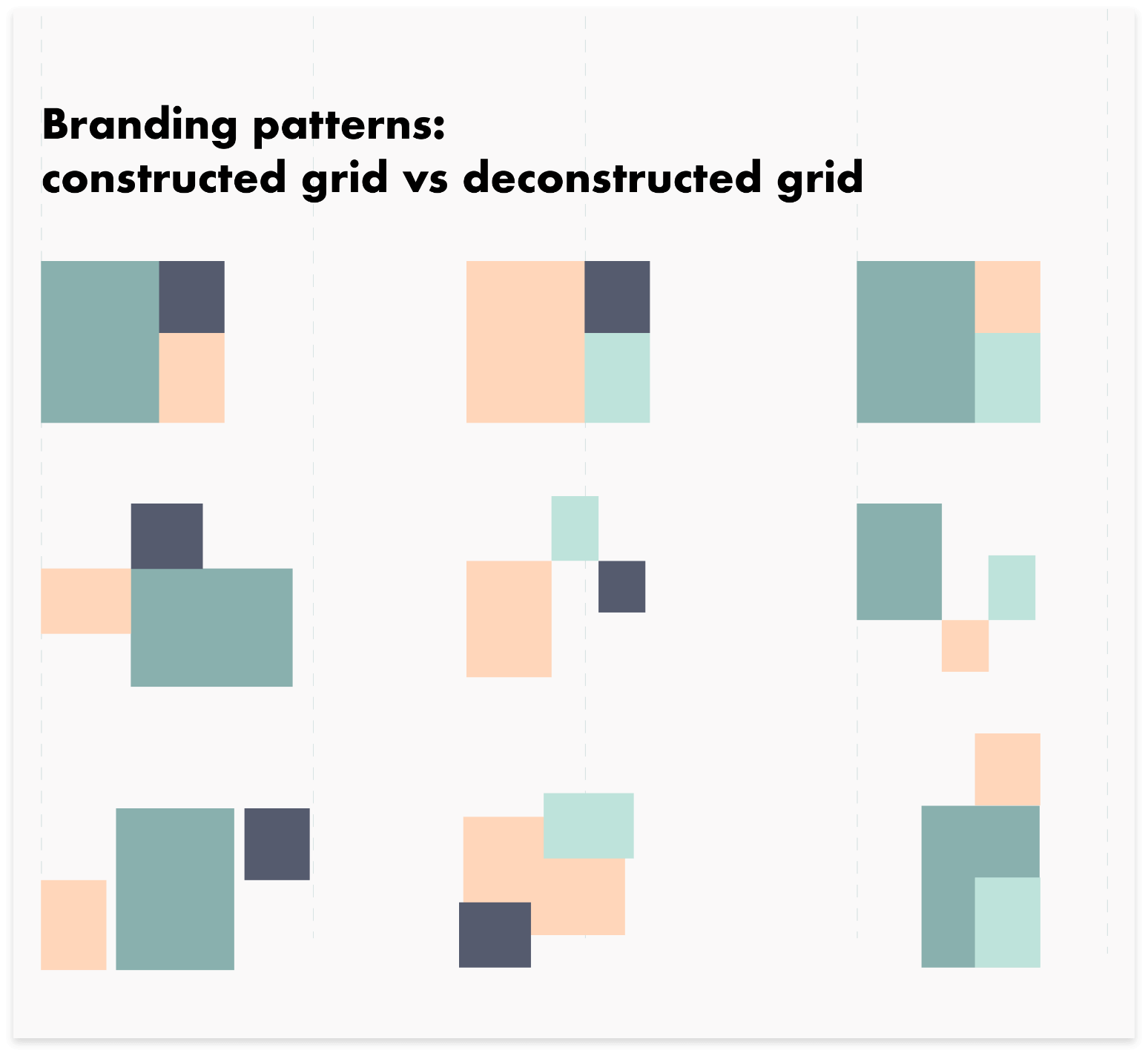
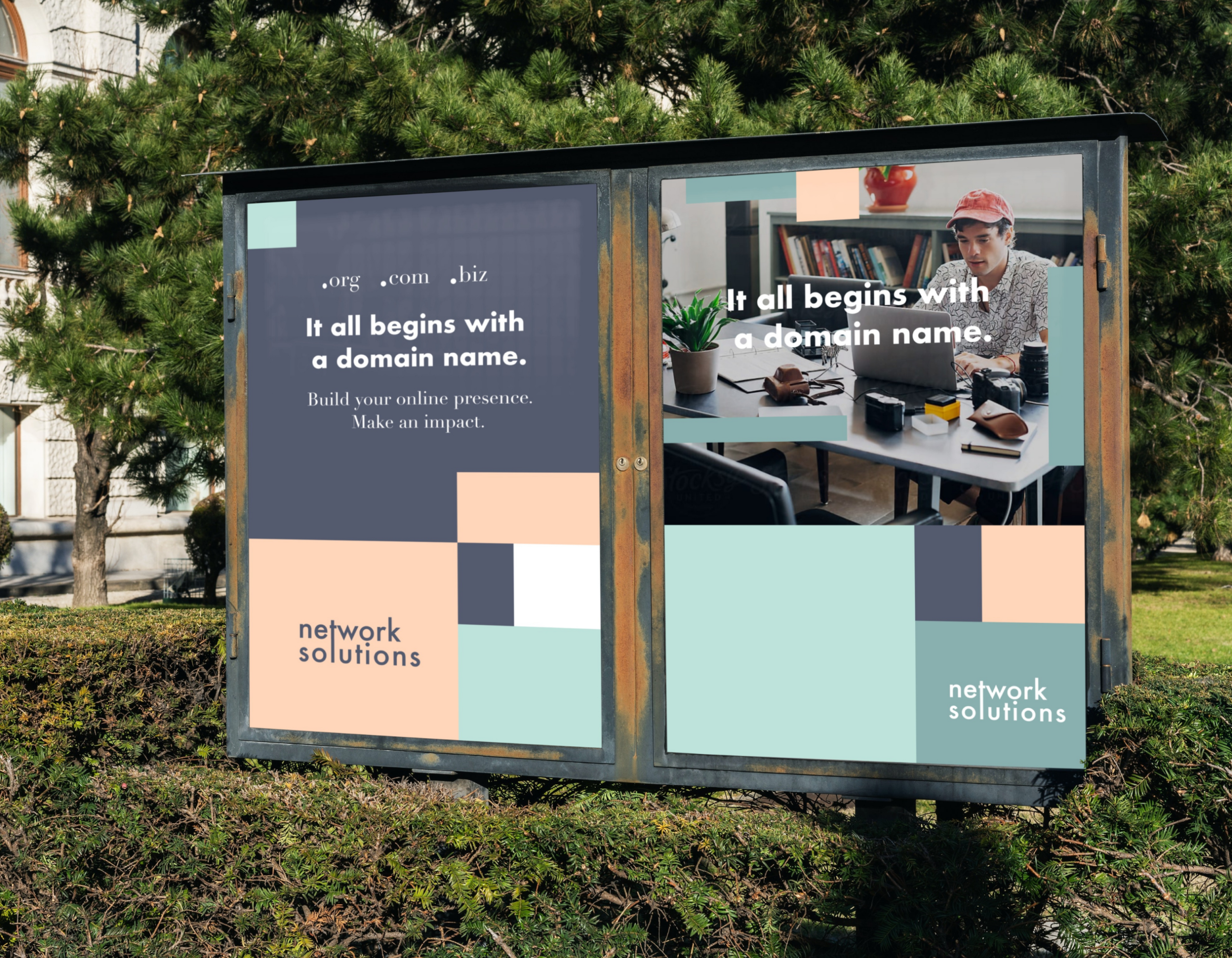
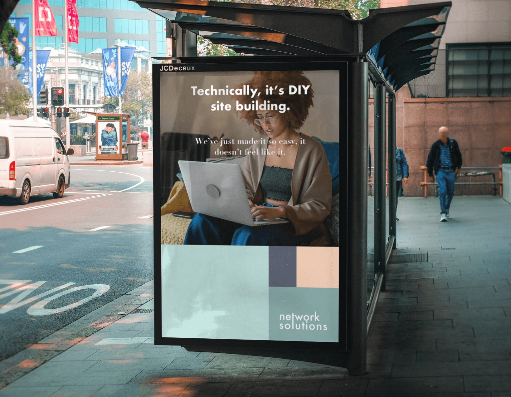
Designing this brand required extensive research on Network Solutions’ target audience. Tech-savvy professionals know what they want. This gave us the green light to focus on the brand concept instead of the products themselves. The concept of the golden ratio grid was a critical part of the redesign process. The combination of color grid placement allows the brand to have a timeless foundation with a modern flare.
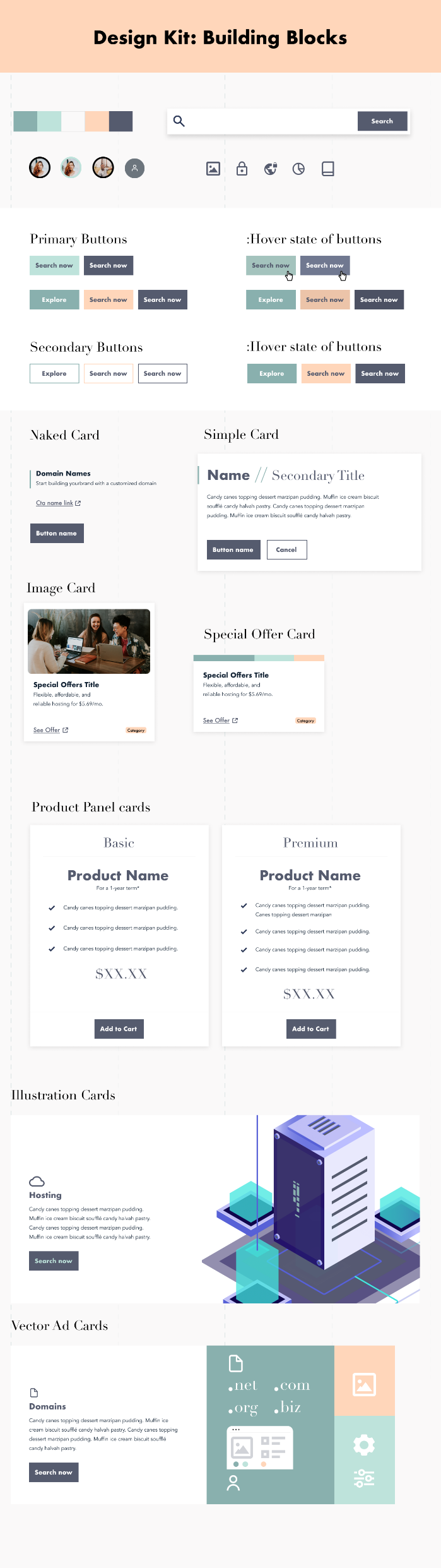
With the guidance of Creative Directors Lexy DeRosa and Matt Hannon, we leveraged feedback on brand voice and developed a design system appropriate for the concept. This work was presented to senior leadership to show ideas on how the brand could be updated for the modern era.
Art Direction
High Fidelity Mockups
Design System
Web Design
Advertising
Visual Designer
These preliminary design components share the same colors, typography, and grid structure for consistency. Typography consists of Didot, Open Sans, and limited use of Futura.
My design references were Stripe, Huge inc, and a few other brands from other industries for inspiration. I enjoyed how Stripe represents modern design meta while not looking like a typical technology company.
All of the content on the homepage design (seen below) is a 1-to-1 ratio to the current site. This decision allows us to show the senior leadership team the new design treatment with familiar content.
The concept of the golden ratio grid was a critical part of the redesign process. The combination of color grid placement allows the brand to have a timeless foundation with a modern flare.